Table of Contents
Think about the last time you learned something new. Did you read about it, watch it on YouTube or see it in an Infographic?
Believe it or not, how you consume content makes a difference in whether you retain that information.
According to Brainrules.net, a person who hears a piece of information will only remember 10% of it three days later.
But someone who sees that same information in a picture will recall 65% of it!
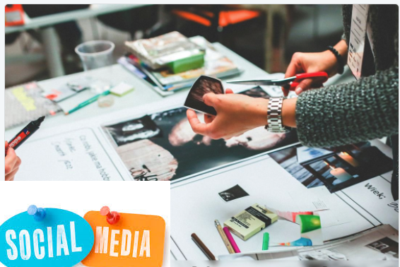
That’s why graphic design and visual content on social media is so important.
Not only do people find it easier to absorb information in a visual format, but they also find it more engaging.
If you want to increase the number of people that click on your social media post and over to your website, always remember:
A good looking graphic grabs the attention while a well-written description seals the deal.
In this post, I’ll share a few simple ways you can design engaging social media graphics.
Plus, you’ll learn how to use them to activate your audience, boost your brand, and meet viewer’s needs.
If you’re not creating visually appealing content that captures audience attention, your competition is. Here’s how visual marketing can help you stand out online!
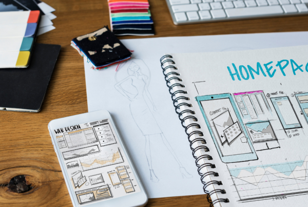
4 Simple Ways to Design Engaging Social Media Graphics
While you don’t want to suffocate your designers and limit their creativity, there are some important guidelines they should follow.
Not only to create beautiful graphics but to also work on raising brand awareness and recognizability!
Remember that your graphics that engage customers, but ones that best represent your business.
Social media graphics should…
- Have some level of consistency across all channels to make sure that your business — and your brand — is giving all audiences the same overall message. Imagine if you used dark, gothic-type graphics on one platform, and colorful, happy graphics on another? Cue confusion!
- Work to build upon your brand’s existing image and complement your business’ identity, rather than challenging it. Your customers have chosen your business for a reason, so while providing new and exciting experiences is good, it’s also important to keep a bit of familiarity.
- Be adjustable so that they can blend into any situation. A great image for social media content promotion is one that can quickly and easily be adjusted to match the audience’s needs, the social media network, and the nature of the content itself. Don’t worry, it sounds more complicated then it is!
Let’s explore this in more detail!
1. Make a Plan
Although diving into the deep end might sound exciting, defining some ground rules first is the best way to ensure consistency of your designs.
You might still wonder why you need a plan for something as simple as this. Good question.
Well, every business is different and the main reason you need a plan is to consider your available resources.
Some things to think about include the following:
- Your team’s existing design experience (or lack of it)
- How much time can they allocate for these tasks
- How many different people are involved in the content production and promotion
- How many different social media networks you plan to cover
- Your marketing budget for social promotion
If your team doesn’t have too much collective design experience under their belts, don’t force it.
Sure, stock photos can look boring because the market is saturated with them, but they’re not the only option.
In fact, it’s easy for anyone to design social media graphics using tools like Canva and Pablo.
Many available tools these days are completely free to use or charge only for advanced features. However, there are still some premium paid tools floating around, like Adobe Suite.
But don’t forget to check if anyone on your team actually knows how to use it properly. Adobe Suite offers powerful features but it’s hardly worth purchasing if you’re only going to use it to design graphics for social media.
Think about your budget before starting to decide whether you’ll be able to add paid tools to your workflow.
Besides paid tools, depending on your budget, you should seriously consider using sites like Freepik and Shutterstock, especially if you want to include vector graphics in your post.
If you only need standard photos, there are plenty of free stock image sites around.
If you are a one-man or a two-woman show, you probably won’t have the need for any additional tools. However, if you have multiple people working on content production and promotion, it’s a good idea to make sure your internal and external communications networks and procedures are up to the challenge.
Here’s an example: Freelancer copywriter writes the article, editor reviews it, graphic designer designs custom graphics, and social media manager uses those graphics to promote the post on selected social networks.
If you have a similar setup, and you are producing multiple content pieces per month, we suggest you use a project management tool in a combination with a simple communication tool like Skype or Slack.
This way you can track the progress of every task, making it much more convenient to communicate minor changes.
Finally, in terms of the number of social networks to cover, that really depends on your business. Or, more importantly, it depends on your audience.
In other words, before you start making any major plans, you need an in-depth target audience research, finding out which platforms your audience uses.
2. Define Some Ground Rules
Too many rules spoil the image, so designers need flexibility in order to build something great. However, rules are still important and it’s a good idea to establish some ground rules early on.
‘Ground rules’ can include…
- Colors — Stick to brand colors, or colors your businesses is associated with.
- Logo — Subtly incorporating your logo helps in building brand awareness and makes it harder for someone else to steal your custom graphics.
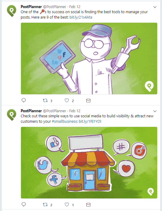
- Consistency — Using consistent design elements is a great way to develop your own unique, recognizable style (like Post Planner does with featured images on their blog)
There’s really no right or wrong here. In other words, the colors you use, the size of your logo, and the consistent elements you choose to use can be whatever you want, as long as it makes sense and looks good.
Having said that, there are a few ‘unspoken’ design rules and some interesting stats that might give you a clue to what could work best for your business.
Colors
In terms of colors, the first thing you need to think about is CONTRAST. This means light text/images on a dark background or vice versa. If you need more help, you can always refer to a Color contrast checker and test if the colors you selected have a good contrast.
Here is one bad example.
 As you can see, contrast is really important if you are using colorful stock images. Pair that with a transparent font and you get a text that’s hard to read.
When your text spans over a colorful background, often it is hard to find a color for your text that will have good visibility overall.
But there is a really simple solution for that. You can blur the background or throw in another background element behind your text and make sure that element is in a good contrast with the color of your text.
Problem solved!
 But there’s more. Do your chosen colors reflect your brand’s personality? Believe it or not, the colors you select can make a massive difference.
 Some colors are seen as fun. Others are seen as fresh. Some as established and trustworthy. What is it that you want your colors to say about your business?
Do your chosen colors work well together, or do they make your content appear a little bit disjointed? There’s lots to think about when it comes to color.
Logo
Incorporating your logo is great for improving brand recall, but placement needs to be strategic. Journal of Marketing research shows audiences prefer high-placed logos for powerful brands, but low-placed logos for lesser known brands.
Another thing to think about is the size of your logo. You don’t want to plaster it over the whole graphic or place it in the middle of your design as it shouldn’t have the main role.
As a matter of fact, your logo should not even be in the supporting cast. If your graphic was a movie, the logo would be that weird looking guy in the background that has no lines but you still notice him if there isn’t an intense scene on the screen.
Here is a good example from SEMrush.

Consistency
If you want to use social media promotion to build brand awareness and recognizability, then we suggest you try to keep consistency in your design.
You can do that in several different ways by being consistent with your:
- Fonts
- Colors
- Using stock images or vector graphics (or a combination of both at the same time)
- Logo usage and placement
- Website URL usage and placement
- Combination of everything above
Here’s a great example from Post Planner. If you’re following them on social media, you will immediately associate their featured image with their brand just by scrolling through your feed.
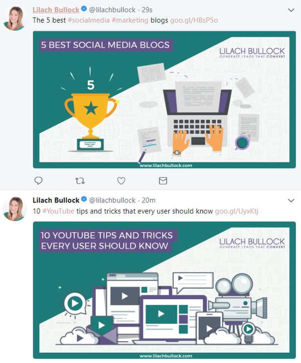
 And another good example from Lilach Bullock.
 3. Adjust Designs to Your Target Audience
There are two ways in which your graphic design may be affected by your audience. The first way is simply ‘who’ your audience is.
Are you marketing to consumers or businesses? B2B or B2C? Determining the ‘who’ can give you some pretty good guidelines for how to create a powerful, effective image.
When marketing to consumers, brands will usually want to try and undermine their power. They want to find themselves on the same level as their consumers.
In other words, they want to seem like they’re ‘friends’, and like they’re approachable. This can be done through an informal, bright, light design or carefully chosen stock photos.
 Things are different when marketing to businesses. B2B marketing is more about emphasizing authority and showing business customers that your brand is in an authoritative position and can help them to find a solution to their problems.
B2B graphics may be more formal, less ‘fun’, and much more informative.
 Another thing to consider is how visible you are to your audience. If you’re working within a highly saturated niche then you’ll want to think about tailoring your approach so that you stand out to your audience.
How can you use your design to show that you’re different and make sure you’re seen by the right eyes?
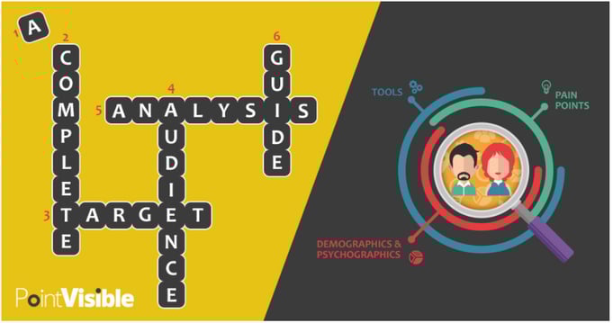
Here’s an example of one of our custom graphics that we made for social media content promotion that got some decent praise. And marketing niche is a prime example of a niche that is saturated with content.
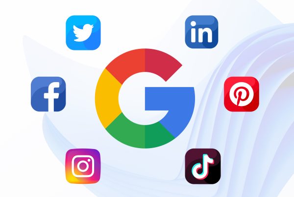
4. Adjust Designs to Different Social Networks Requirements
We all know that different social networks have their own different users and different demographics.
They also have their own unique ways of working, and that means that the exact same graphic is unlikely to be able to span all social channels and succeed. You need to adjust your approach based on your platform.
On top of that, each network has different requirements for the size of the picture/graphic you want to use. For more details about ideal image and video sizes check out this guide.
And did you know that the type of image you use can affect how much you’re paying to promote your content?
For example, if the image you use for Facebook PPC contains a lot of text, your cost per click will increase. Facebook manages to do this through a cleverly integrated algorithm which scans your chosen images for any included text. ?
1. Facebook & Twitter
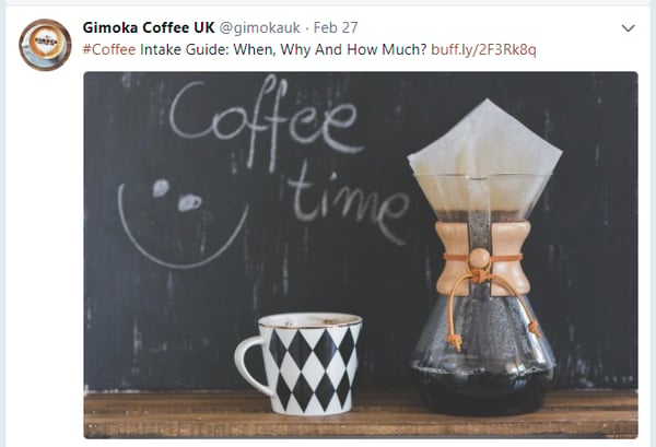
Facebook is primarily used for entertainment purposes. It’s ‘downtime’ for many people. In other words, Facebook is a place where people go to have fun. That means that the best type of image for promoting Facebook content is informal, light, humorous, and bright.
Over the years, Twitter has primarily become a news source, but the same rules apply as with Facebook.
Don’t forget that both Facebook and Twitter are saturated with lots of different kinds of content promotion so it can get quite hard to stand out purely from the design side.
3. LinkedIn
As a professional network, some additional thought needs to be put into promoting content on LinkedIn. As they themselves state that ‘logos’ get 6 times more traffic to pages, be sure to include brand logos in your graphics, or any additional info about your business.
Also, a more formal and conservative style is welcomed since B2B audiences care more about the message than about being flashy.
4. Pinterest
Pinterest requires a slightly different approach. As more of a creative platform, graphics to promote Pinterest content should follow form and be creative themselves.
Images taken from infographics work well, along with images taken from visually-dominated guides.
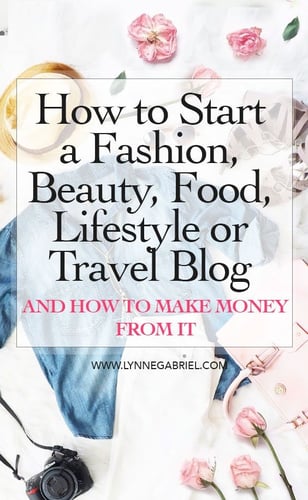
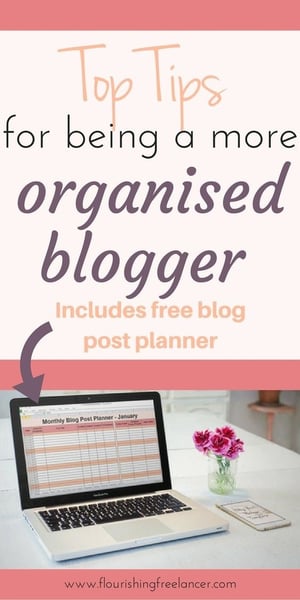
Bloggers that use Pinterest for promotion, often create a bit longer graphics. Included are a few images from the post or related to the topic, along with the title of the post, all done in bright colors, with nice fonts and even some attention-grabbing details.
This article was originally published in 24 April 2018. It was most recently updated in November 28, 2022 by